Design Shift
WORDS BY PAIGE GLAZER PHOTOS BY ALE SANTANA
Somewhere in between here and there and do we, don’t we is where Stephanie Hoey and her husband, Dan, found themselves last year around this time. Like so many, the young couple had a dream to build a custom home of their own. Stephanie, an interior designer, and Dan a consultant in business Aviation, had the perfect plan designed for their family of four.
Richmond Hill had all the right vibes—the great school system where they could send their girls, the close proximity to the big city, but the small town feel like the towns where they both grew up. “The idea of our kids growing up with the same set of friends throughout grade school, being far enough out of town, but close enough to the city—Richmond Hill was everything we wanted,” Stephanie says. “We sold our home in Pooler, we found the lot, and then it was time to press go when the rug was yanked from beneath us.”
The all-too-familiar story of the rising cost of lumber coupled with the scarcity in tradesmen made the cost to build fall outside of their financial comfort zone.
Deflated, Stephanie says she gave herself a day or two to mourn the unforeseen change in their plans before calling her realtor to craft a solution. “Luckily, we secured a rental property so that we didn’t have to rush a decision.”
With the upset in building dynamics, Stephanie knew that she was going to have to get creative in order to get what she wanted in this move toward home. “Building was out, so we began the search for a fixer upper—a complete design shift—in mindset and action,” she recalls. “Our realtor called one of her local friends who had one she wasn’t sure would suffice, but as it turned out, it was perfect!”
Stephanie majored in Fashion Marketing and Management in college. “I got my start working in fashion, but as time went on, I realized that I liked picking out fabric for sofas more than I did for dresses,” she laughs. It wasn’t until she was pregnant with her first child and sharing her nursery on social media that she had accidentally created a following willing to pay for her help in their homes. “If I look back on my childhood, I always had something funky happening in my room; I think I rearranged the furniture weekly!”
Stephanie and Dan bought the fixer-upper and roughly a year later, the work is still going but it’s feeling more and more like their forever home.
Stephanie’s Tour
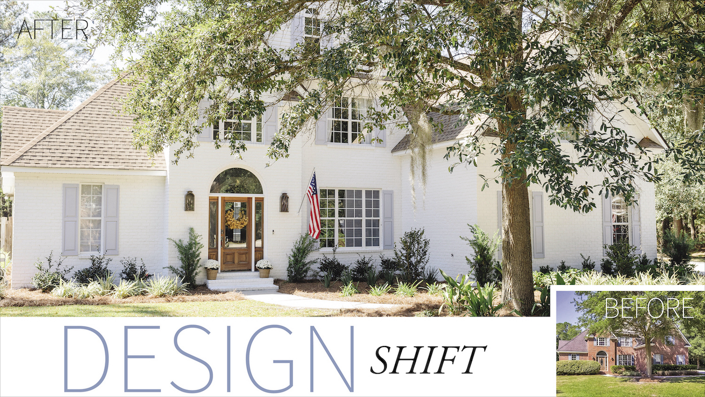
When we were planning to build a house, I knew that I wanted white brick. So when we found this house, the fact that it was brick made me so happy! I’m also a huge fan of arches, so that arch over the front door was icing on the cake!
If you follow me on social media, you know that I’m a huge fan of blue and white, so blue shutters were an obvious choice.
The landscaping was super overgrown and unruly. The roof was in terrible shape and leaking in several places. Our last house was in a newly developed neighborhood with no mature trees or landscaping. This oak tree in the front yard is and was absolutely stunning and something you wouldn’t be able to buy. It was definitely an added bonus. The sides and back of our house have vinyl siding. Only the front is brick.
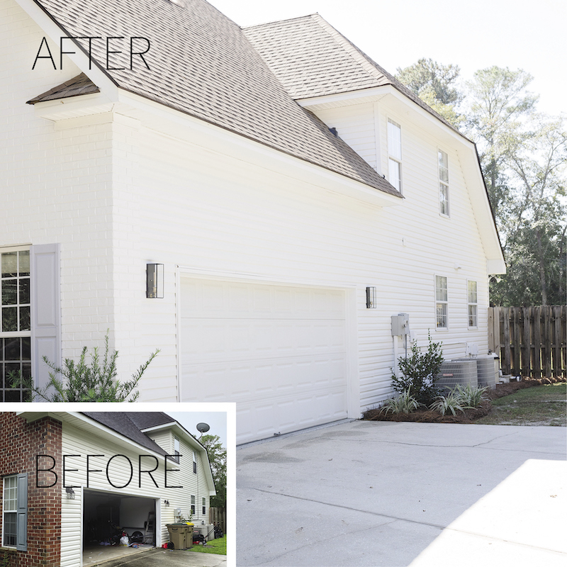
We were concerned about having to replace all of the siding but we talked to many people and found we could just replace some cracked pieces and paint it to match the brick on the front. I remember the side of the house as one of the areas that bothered me the most originally. It didn’t help that it was the first thing you’d see when you drove into our driveway.
We painted the siding, changed out the lights, moved the trash cans to the backyard, and landscaped the area around the AC units and pool pump. The difference is amazing and a much prettier sight to come home to everyday!
My favorite part about this whole house was the arch over the front door. It has so much charm and is not something you see much outside of Ardsley Park. But it felt lost on this house. It needed to stand alone to be brought out from everything else. We originally thought we’d paint it blue like the shutters but left the door to be painted last. I’m so glad we did that because once I saw the natural wood tone with everything else, I fell in love and decided to keep it. We just sanded it down, re-stained, and sealed it. It’s stunning.
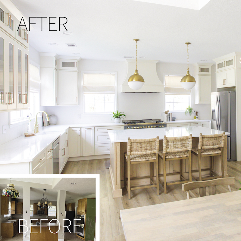
The kitchen! This was the easiest space for me to visualize. I couldn’t believe the amount of space it had. The biggest change was removing the weird “island” that was way too far away from everything else. We converted the old laundry room to a walk-in pantry, added a mudroom/laundry room outside of the powder room, and took out the desk area in the old kitchen and opened that wall up to the living room.
I also loved the idea of bringing our dining room into the kitchen. Our old house had a formal dining room away from everything else and we never used it. Having our ”dining room” in our kitchen now is great, and we use it every single day!
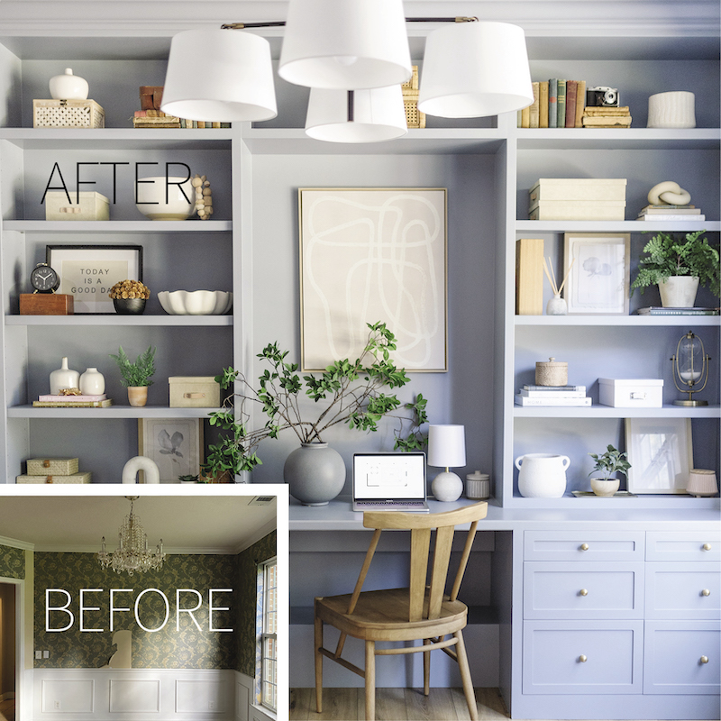
We turned the existing dining room into a private office! A home office is something I definitely knew I needed. It was a room I was focused on when we were building and the first thing I thought of when I saw this formal dining room right off of the entry. It had three very weird openings and strange columns. I personally knocked the columns down myself and we closed in the other openings. We added a pair of French doors and a peekaboo window that looks into the living room. This room has a great large triple window that fed so much light into the living room. I didn’t want to lose that light when we closed in the walls, but also needed it closed for privacy. So the peekaboo window was a great solution.
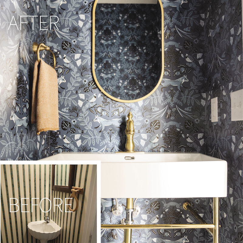
The powder room had this teeny little corner sink because the door opened into the room and the wall started very close to the wall with the mirror. We changed the door to a pocket door and moved the door opening down slightly to be able to accommodate a true sink.
I always tell clients that powder rooms are a great space to go bold and have fun! So that’s just what I did here! My husband thought I was nuts to use such a dark bold pattern in a tiny room with no windows. It turned out great and is now one of my favorite rooms in the house! And it’s the room that all our guests see and they seem to love it too!
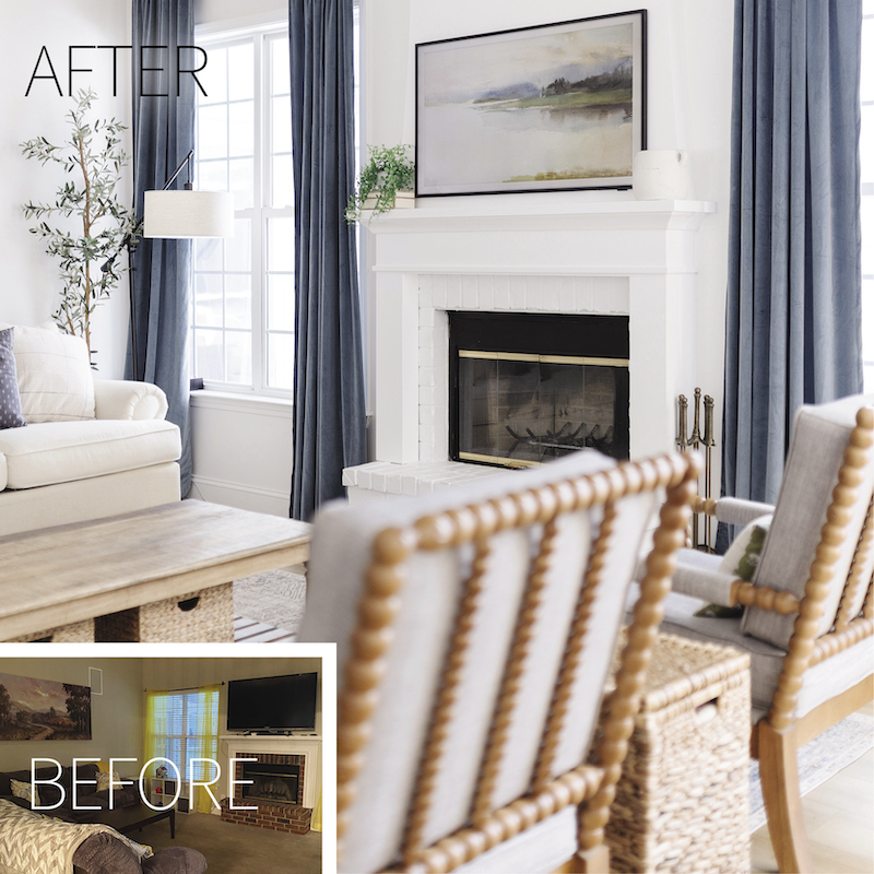
The old living room was dark and depressing. I have to be honest, it was a little hard to visualize this one. I knew immediately the fireplace had to change. Just a simple tweak like bringing the trim of the fireplace to the top of the wall made such a difference and makes that wall appear taller. We also opened the other side of the wall up to the kitchen.
